Pixel
SIDE: Key Features Installation Quick Start Checklist Theme Settings Color Scheme Website width Thumbnails Per Row Title Font & Body Font Pagination Style Image Click Action Show Related PostsBrand
Navigation Optional Pages Comments Updating the Theme Troubleshooting / FAQ Credits and Support Announcement Bar Social Accounts
Pixel is a Ghost theme built for editorial and visual-first publications — portfolios, design magazines, and photography-driven blogs. This page covers installation and every setting currently confirmed in the theme's Design panel.
Key Features
- Gallery-style homepage grid with adjustable thumbnails per row
- Editorial typography with separate heading and body font controls
- Dropdown-capable navigation menu
- Related posts module with customizable title
- Flexible homepage width (default or fullwidth)
Installation
- Download the Pixel theme zip file.
- In Ghost Admin, go to Settings, then Design and branding, then Change theme.
- Click Upload theme and select the zip file.
- Once validated, click Activate.
Note: if the upload is rejected, the most common cause is the zip containing a wrapper folder instead of the theme files at the top level.
Quick Start Checklist
Right after activating the theme, complete these steps in order:
- Set Accent color, Publication icon, Publication logo, and Publication cover under Design → Brand.
- Choose Heading and Body fonts under Brand → Typography.
- Set Color scheme, Navigation layout, and site-wide Title/Body fonts under Design → Theme → Site wide.
- Configure Website width and Thumbnails per row under Homepage.
- Set Pagination style, Image click action, and Related posts under Post.
- Build your menu under Settings → Navigation, including any dropdown submenus.
Theme Settings
All settings below live under Design → Theme, unless noted otherwise.
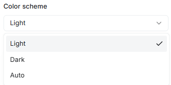
Color Scheme
Controls the overall color mode of the site.
- Light (default)
- Dark
- Auto (follows the visitor's system preference)
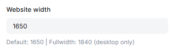
Website width
Maximum layout width on desktop, entered in pixels.
Default: 1650px.
Fullwidth: 1840px (desktop only).
Known behavior: this field does not always reflect instantly in the live preview panel when a custom value is typed. Save the change and check View site to confirm it has been applied.
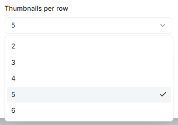
Thumbnails Per Row
Number of post thumbnails shown per row on the homepage grid.
Available options: 2, 3, 4, 5, 6. Current value: 5.
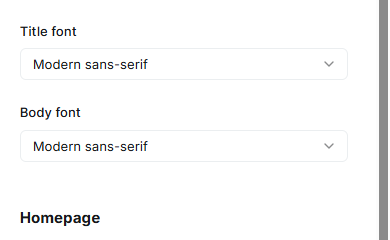
Title Font & Body Font
Controls the font family used for headings and body text site-wide.
- Modern sans-serif (default)
- Elegant serif
Both Title font and Body font share the same two options.
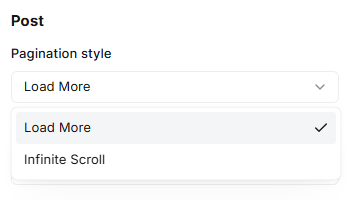
Pagination Style
Determines how readers load older posts.
- Load More (default) — shows a button to load additional posts
- Infinite Scroll — automatically loads more posts as the reader scrolls down
Steps
- Go to Ghost Admin → Design → Theme → Post.
- Open the Pagination style dropdown.
- Select your preferred option.
- Click Save.
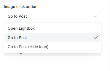
Image Click Action
Controls what happens when a visitor clicks a post's featured image in the grid view (homepage, tag pages, author pages).
Three modes:
- Open Lightbox — Clicking the image opens it in a fullscreen lightbox instantly, without leaving the page. Best for portfolio or visual-first sites.
- Go to Post — Clicking the image navigates to the full post. A small expand icon appears on hover as an optional shortcut to the lightbox. Best for blogs and content-first sites.
- Go to Post (Hide Icon) — Same as above, but the expand icon is fully hidden for a cleaner look.
Location: Settings → Design → Post → Image Click Action
Show Related Posts
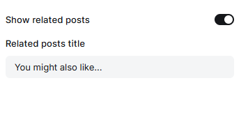
Controls whether a "related posts" section appears at the bottom of each post page, showing other posts that share the same tag.
- Show related posts — Toggle on/off. When enabled, a grid of related posts (matched by shared tags, up to 15) is displayed below the post content. When disabled, no related section appears.
- Related posts title — Custom heading text shown above the related posts grid (default: "You might also like..."). Leave it blank to hide the heading entirely while still showing the posts.
Location: Settings → Design → Post → Show related posts / Related posts title
Brand
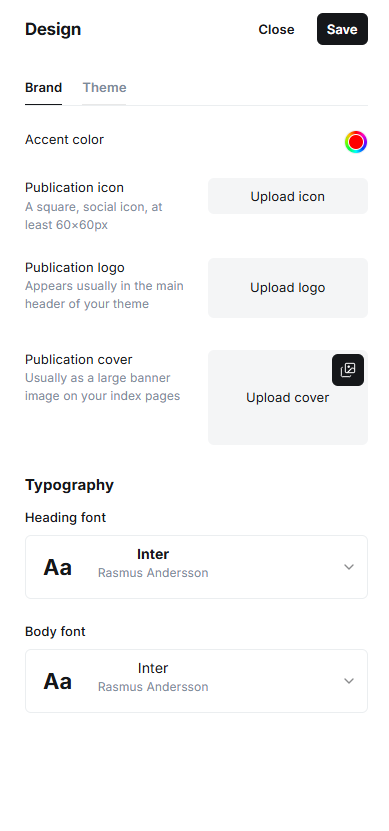
Located under Design → Brand, separate from the Theme tab.
- Accent color: the primary brand color used for buttons, links, and highlights.
- Publication icon: a square social or favicon-style icon, minimum 60×60px.
- Publication logo: the main logo displayed in the site header.
- Publication cover: a large banner image typically used on index pages.
- Heading font (Typography): currently set to Inter, by Rasmus Andersson.
- Body font (Typography): currently set to Inter, by Rasmus Andersson.
Note: Brand Typography fonts and Theme Site wide fonts appear to be two separate controls. Worth confirming whether one overrides the other.
Navigation
Configured under Settings → Navigation. Pixel supports dropdown submenus in the primary nav using a prefix syntax entered directly in the Label field (not the URL field).
Dropdown Syntax
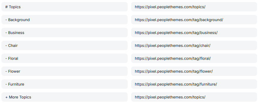
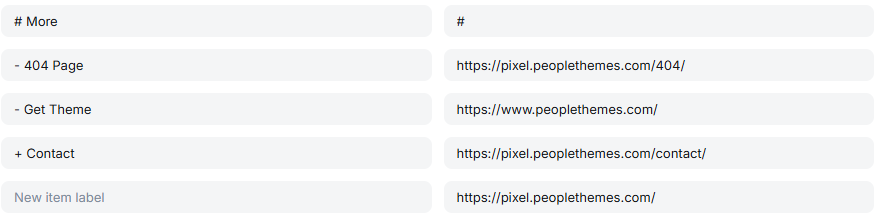
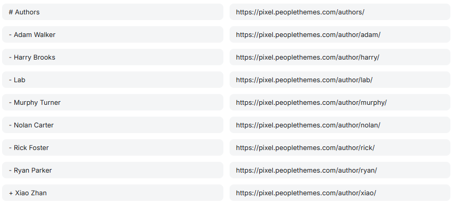
- # prefix — marks the item as a top-level dropdown parent (e.g.
# Topics,# More,# Authors) - - prefix — a regular submenu item nested under the parent (e.g.
- Background) - + prefix — the last submenu item, which receives special highlighted styling (background + accent color) via the theme's default CSS. This is what the "More Topics" / "Contact" / "Xiao Zhan" items look like — visually distinct from the other submenu items.
Any item without a - or + prefix, placed after a # item, ends that dropdown.
Confirmed Examples
Topics dropdown:
- Background, Business, Chair, Floral, Flower, Furniture (regular items)
- More Topics (highlighted last item, + prefix)
More dropdown:
- 404 Page, Get Theme (regular items)
- Contact (highlighted last item, + prefix)
Authors dropdown:
- Adam Walker, Harry Brooks, Lab, Murphy Turner, Nolan Carter, Rick Foster, Ryan Parker (regular items)
- Xiao Zhan (highlighted last item, + prefix)
Steps
- Go to Ghost Admin → Settings → Navigation.
- Add a new item and type # followed by a space, then your dropdown title, in the Label field (URL can point to a relevant landing page, e.g. a tag archive).
- Add items below it with a - prefix for regular submenu items.
- Optionally end the dropdown with one item using a + prefix for a visually highlighted call-to-action style item.
- Click Save.
Optional Pages
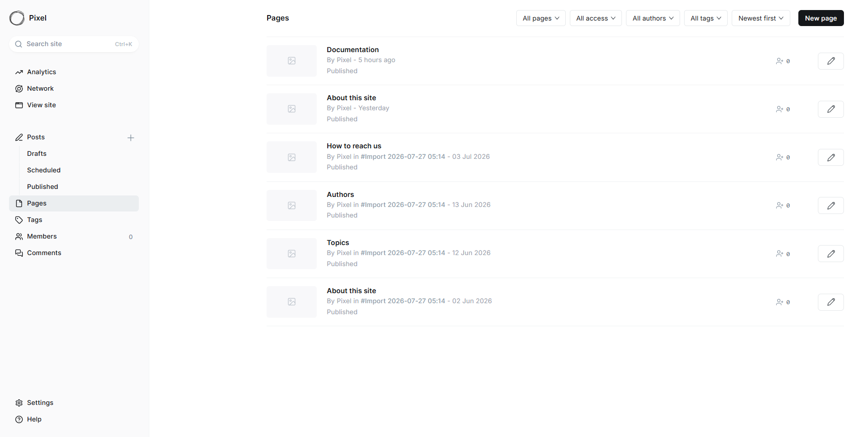
Pages let you create standalone content separate from your blog posts — ideal for static content such as About, Contact, or Privacy Policy.
Steps
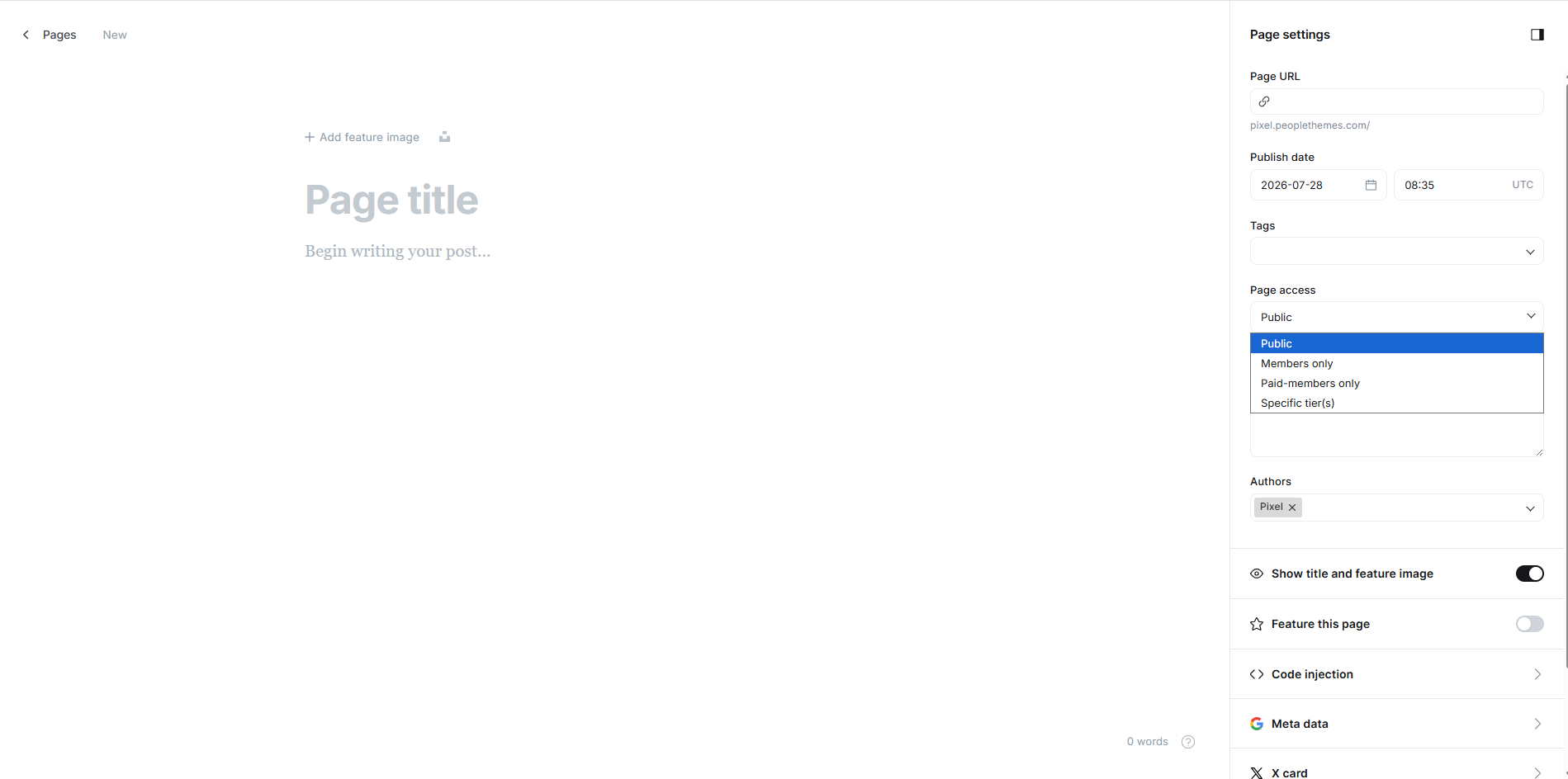
- Go to Ghost Admin → Pages.
- Click New page.
- Enter a page title and write your content using the Ghost editor.
- Configure page settings in the right sidebar (URL, tags, access, excerpt, author).
- Click Publish to make the page live.
Comments
Ghost has a native commenting system that can be enabled under Settings → Membership → Access (or a dedicated Comments section, depending on Ghost version), letting logged-in members comment on posts. Some themes add extra styling controls for how the comment box and comment list appear.
Steps (native Ghost)
- Go to Ghost Admin → Settings.
- Find the Comments setting (under Membership or as its own section).
- Choose who can comment: All members, Paid-members only, or Off.
- Click Save.
Updating the Theme
Theme settings (color scheme, fonts, layout choices) are typically stored in Ghost's database, not in the theme files. This usually means you can upload a newer version of the theme zip without losing your configuration. Always back up any direct code edits before updating, since those may be overwritten.
Troubleshooting / FAQ
Q: Website width changes do not appear immediately in the preview
A: This is a known display quirk. The preview field is likely debounced. Save your change and check View site to confirm it was applied.
Q: Thumbnails look stretched or cropped
A: Check whether Thumbnails per row is mismatched with the aspect ratio of your uploaded images.
Q: My dropdown menu (e.g. Topics) is not showing sub-items
A: Confirm the parent and child relationship is set correctly in Settings → Navigation.
Credits and Support
- Theme: pixel
- License: MIT
- Support: support@peoplethemes.com
Announcement Bar
Ghost has a native Announcement Bar feature for showing a short message (e.g. a promotion or notice) in a thin bar above the header, with a customizable background color.
Steps (native Ghost)
- Go to Ghost Admin → Settings → Announcement bar.
- Enter your message text.
- Choose a background color and visibility (all visitors, members only, etc., depending on Ghost version).
- Click Save.
Social Accounts
Steps
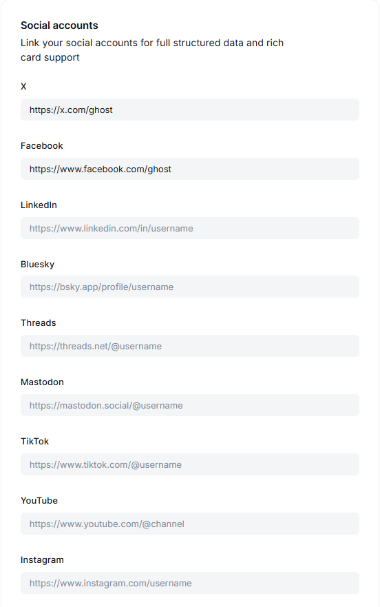
- Go to Ghost Admin → Settings → Social accounts.
- Paste your full profile URL into the X and/or Facebook field.
- Click Save.
Updates
Release First Version 28 July 2026