Notif
Notif is a clean, minimal Ghost theme for personal bloggers — built around simple, readable post cards and a handful of post layout styles you can mix and match per article.
SIDE: Key Features · Installation · Quick Start Checklist · Theme Settings · Post Settings · Post Layout Templates · Navigation · Optional Pages · Blocks · Image Lightbox · Social Accounts · Troubleshooting / FAQ · Credits and Support
Documentation
Notif keeps the feed simple: a title, an optional excerpt, tag, and date — nothing else competing for attention. Where Notif stands out is on the post page itself, where you can pick from seven different layout templates (Hero, Banner, Cover, Full Width, Wide, Small, Background) to change how the feature image and header are presented, article by article.
Key Features
- Minimal, text-first post cards with granular show/hide toggles
- Seven selectable post layout templates for the feature image and header
- Three pagination styles: Infinite Scroll, Load More, and Pagination
- Built-in image lightbox (click-to-zoom gallery) on post images
- Custom multi-level dropdown and "More" overflow navigation, built without code
- Dedicated Authors directory (slug-based) and Tags directory (template-based)
- Built-in Blocks — button and shop-button shortcodes typed directly in the editor
- Adjustable site-wide background color, image corner radius, and post grid gap
- Social account integration for sharing and structured data
Installation
- Download the theme
.zipfile. - In Ghost Admin, go to Settings → Design and branding → Change theme.
- Click Upload theme and select the
.zipfile. - Once it's validated, click Activate.
If the upload is rejected, make sure the .zip contains the theme files directly at the top level, not inside an extra wrapper folder.Quick Start Checklist
Right after activating, do these in order:
- Set your logo, publication icon, and accent color under Settings → Design and branding → Brand.
- Set your Background Color, Image Border Radius, and Post Grid Gap — see Theme Settings.
- Decide which post card fields to show (title, tag, excerpt, date) and which pagination style to use.
- Choose your default Post Layout Template style for new posts — see Post Layout Templates.
- Set up your Navigation — see Navigation for the prefix syntax.
- Create the optional Authors and Tags pages — see Optional Pages.
Theme Settings
All of the settings below live under Settings → Design and branding → Theme.
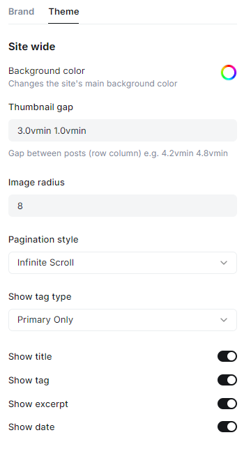
Background Color
Changes the site's main background color. Click the color swatch and pick any color. Default: #ffffff (white).
Post Grid Gap
Controls the spacing between post cards in the feed. Enter two values — row gap then column gap.
Default: 3.0vmin 1.0vmin.
- Example:
4.2vmin 4.8vmin= a looser row gap with slightly wider columns
Image Border Radius (px)
Controls how rounded the corners of images are across the site, in pixels.
Default: 8. Enter 0 for sharp, square corners.
Pagination Style
Controls how visitors load more posts on the homepage, author, and tag feeds.
Available options:
- Infinite Scroll (default) — automatically loads more posts as the visitor scrolls down.
- Load More — shows a Load More button beneath the feed.
- Pagination — shows numbered page navigation.
Tag Display
Controls which tags show on each post card, if Show Tag is enabled.
Available options:
- Primary Only (default) — shows only the post's primary tag.
- Show All — shows every tag attached to the post, comma-separated.
Show Title / Show Tag / Show Excerpt / Show Date
Four independent toggles controlling which fields appear on each post card in the feed. All are On by default — turn any of them off to simplify the card further.
Post Settings
These live under the same Theme tab, grouped under Post.
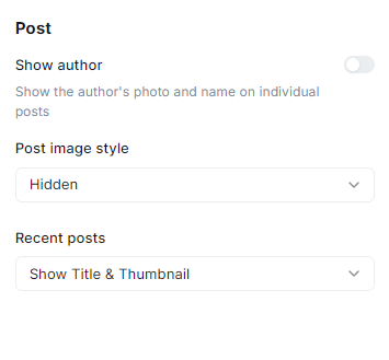
Show Author
Toggles whether the author's photo and name display on individual post pages. Default: Off.
Post Image Style
Controls how the feature image displays on the post page itself (separate from the Post Layout Templates, which is chosen per-post).
Available options:
- Small — displays a smaller, contained feature image.
- Hidden (default) — the feature image is not shown on the post page.
Recent Posts
Controls the "read more" section shown at the bottom of every post page.
Available options:
- Show Title & Thumbnail (default) — displays the post title with a small thumbnail.
- Show Title Only — displays only the post title, no image.
- Show Thumbnail Only — displays only the thumbnail image.
- None — hides the section entirely.
Post Layout Templates
Beyond the site-wide Theme settings, Notif ships with seven selectable templates that change how the feature image and header are displayed on an individual post. Pick one per post from the Template dropdown in the post's settings sidebar in the Ghost editor.
| Template | What it does |
|---|---|
| Hero | Large, prominent feature image at the top of the post |
| Banner | Wide banner-style feature image |
| Cover | Full-bleed cover image behind the post title |
| Full Width | Feature image and content span the full page width |
| Wide | A wider-than-default content column |
| Small | A more compact, minimal header treatment |
| Background | Feature image used as a full background behind the header |
If no template is selected, the post uses the Default layout (standard header, no special image treatment).
Navigation
Set up navigation under Settings → Navigation. Notif builds dropdowns and a "More" overflow menu from a single flat list using prefixes in the Label field — no code required.
Special prefixes:
#– Starts a dropdown group (shown with an arrow icon in the header).-– A regular sub-item inside an open#dropdown.+– The last sub-item inside a#dropdown — closes the group.%– Starts a "More" overflow group (shown with a three-dot icon).@– A regular sub-item inside an open%group.$– The last sub-item inside a%group — closes the group.- (no prefix) – A normal top-level link.
Example:
| Label | Result |
|---|---|
#Work |
Starts a dropdown labeled "Work" |
-Photography |
Sub-item inside "Work" |
+Film |
Last sub-item inside "Work" — closes the dropdown |
About |
Plain top-level link |
%More |
Starts a "More" overflow group |
@Newsletter |
Sub-item inside the "More" group |
$Contact |
Last sub-item inside "More" — closes the group |
Unlike Grid and People, Notif requires an explicit closing prefix (+or$) on the last item of each dropdown group — groups don't close automatically when a plain item follows.
Optional Pages
Notif ships with two directory pages: Authors and Tags — but they're activated differently, so follow the right method for each.
Authors Page
This template activates automatically based on the page's URL slug, not a manual selection.
- Create a new Page in Ghost Admin.
- Set the page's slug (in the page settings sidebar, under the URL field) to exactly:
authors - Publish the page — the content area can be left empty; the author directory renders automatically.
Tags Page
This template is manually selected from the Template dropdown.
- Create a new Page in Ghost Admin and give it any title you like.
- Open the page's settings sidebar and find the Template dropdown.
- Select Tags from the list.
- Publish the page — any content you add displays above the tag list.
Blocks
Notif includes three lightweight button "blocks" you can type directly as plain text in the Ghost editor — no HTML card needed. Each is written as a single paragraph using :: markers; the theme's JavaScript converts it into a styled button on the live site.
Two Button
::people1 "Button 1 text" "https://button1-url.com" "Button 2 text" "https://button2-url.com" "align"::
Renders a solid button and an outline button side by side. align is optional (left, center, right) — defaults to center.
Shop Button
::people2 "Button text" "https://shop-url.com" "align" "iconNumber"::
Renders a single button with a cart icon. align is optional (defaults to center); iconNumber picks between three built-in cart icon styles (1, 2, or 3, defaults to 1).
Single Button
::people3 "Button text" "https://url.com" "style" "align"::
Renders one button. style is optional (solid or outline, defaults to solid); align is optional (defaults to center).
Image Lightbox
Images inside your post content automatically open in a full-screen, zoomable lightbox when clicked — no setup required. Readers can zoom, swipe between multiple images in a gallery, and close with Esc or the close button.
Social Accounts
Notif pulls your social links from Ghost's built-in Social Accounts settings and displays them wherever the theme's social icons appear.
Ghost Admin → Settings → Social Accounts
Paste the full URL of each profile into its corresponding field and save. Notif ships with icons for: X / Twitter, Facebook, Instagram, LinkedIn, Threads, Mastodon, TikTok, YouTube, and Bluesky.
Troubleshooting / FAQ
My navigation dropdown won't close, or extra items got pulled into it
Notif requires an explicit closing prefix on the last item of a dropdown — use + for the last item in a # group, or $ for the last item in a % group. Unlike some other Ghost themes, a plain item alone will not automatically close the group.
The Authors page shows the default page layout instead of the author list
Check the page's URL slug — it must be exactly authors. This template activates by slug, not by a Template dropdown selection.
The Tags page is blank or shows the default layout
Make sure you selected Tags from the page's Template dropdown in the Ghost editor sidebar — this template is chosen manually, not by slug.
My Blocks shortcode isn't turning into a button
Make sure the whole line is its own paragraph (nothing else in the same paragraph), uses double quotes exactly as shown, and starts with :: and ends with ::.
A post's feature image isn't showing on the post page
Check Post Image Style under Theme Settings — it's set to Hidden by default. Also check whether the post has a Post Layout Template selected, since some templates display the image differently.
Clicking an image in a post doesn't open the lightbox
The lightbox only applies to images placed inside the post content itself (not the feature image). Make sure the image was inserted as an Image card in the editor.
Credits and Support
- Theme: Notif
- License: MIT
- Support: support@peoplethemes.com
- Live demo: z.doa.earth