Linkspot
TOP: Updates · Download · Blocks
SIDE: Key Features · Installation · Quick Start Checklist · Theme Settings · Profile · Link List & Navigation · Section Dividers & Collapsible Groups · Automatic Link Icons · Homepage Tabs · Button Style · Background · Social Links · Floating QR Code · Share Modal · Post Modal & Internal Links · Post Card Display · Featuring Posts · Optional Pages · Authors Directory · Tags Directory · Membership · Updating the Theme · Troubleshooting / FAQ ·
Credits and Support ·
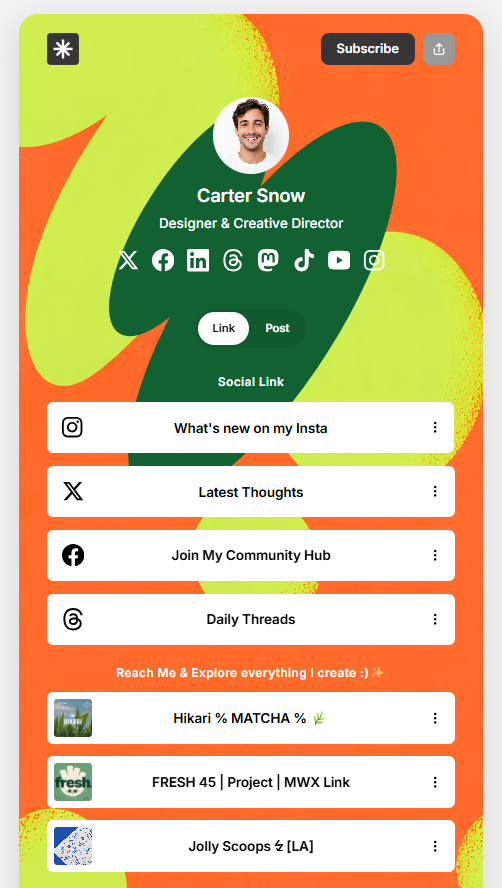
Linkspot is a clean, link-in-bio Ghost theme. It turns your Ghost site into a single-page hub — profile, social links, and a tappable list of links — while still giving you the full power of Ghost's blog underneath it. This page covers everything you need to set it up and make it your own.
Key Features
- Single-page, link-in-bio style homepage (profile, tagline, social icons, link list)
- Automatic icon detection for 100+ popular services, apps, and payment providers, plus 30+ manual tag codes for anything a URL can't describe
- Section dividers and collapsible link groups using a simple prefix syntax in Ghost's Navigation settings
- A segmented toggle (two tabs) that can show any mix of Links, Posts, a specific Tag, or a specific Author on the homepage
- Solid, Glass, and Bold button styles, each with adjustable corner rounding, shadow, and color
- Solid color, image, or looping video backgrounds
- Built-in Authors directory and Tags directory page templates
- Floating "Scan on mobile" QR code on desktop
- Custom share modal and a bottom-sheet post preview modal with swipe-to-dismiss on mobile
- Native Ghost membership support (Subscribe / Sign in / Account)
Installation
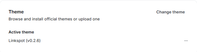
- Download the theme .zip file (Linkspot.zip).
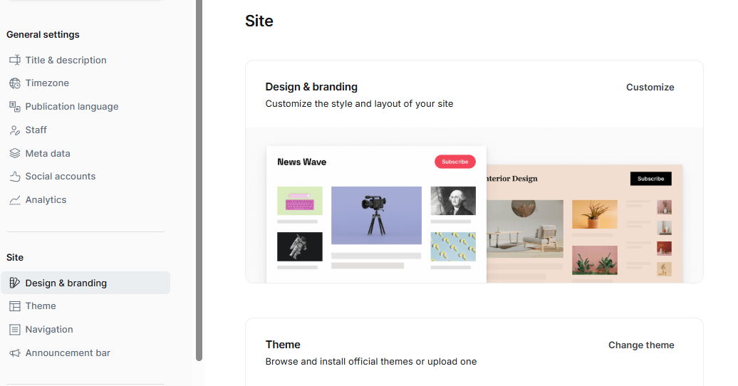
- In Ghost Admin, go to Settings → Design and branding → Change theme.
- Click Upload theme and select the .zip file.
- Once it's validated, click Activate.
Note: If the upload is rejected, the most common cause is the zip containing a wrapper folder instead of the theme files at the top level — make sure package.json, default.hbs, index.hbs, etc. sit at the root of the zip.
Quick Start Checklist
Right after activating, do these in order:
- Set your name, avatar, and tagline — see Profile.
- Add your links under Settings → Navigation using the group syntax — see Link List & Navigation.
- Decide what the two homepage tabs show (Link, Post, Tag, Author, or None) — see Homepage Tabs.
- Pick your button style and colors — see Button Style.
- Pick a background (color, image, or video) — see Background.
- Connect your Social Accounts in Ghost Admin — see Social Links.
- Create the optional Authors and Tags directory pages if you want them — see Optional Pages.
Theme Settings
All of the settings below live under Settings → Design and branding → Brand and theme in Ghost Admin, unless noted otherwise.
Profile
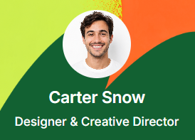
At the top of the homepage, Linkspot shows your profile block:
- Avatar – upload an image; if left empty, a placeholder avatar icon is shown instead.
- Name – your display name, shown as a heading under the avatar.
- Tagline – a short bio. Long taglines automatically collapse to 3 lines with a "…more" button; visitors can expand it and collapse it again with "less".
[SCREENSHOT: profile block on frontend]
Link List & Navigation
Linkspot turns Ghost's regular Navigation menu (Settings → Navigation → Primary navigation) into your link-in-bio list — there's no separate "links" area to manage.
Each navigation item becomes one row in the list, complete with an automatically matched icon (see Automatic Link Icons below).
Section Dividers & Collapsible Groups
Linkspot gives you two ways to organize a long link list, both controlled entirely from Settings → Navigation — no code needed.
Section dividers:
Set a navigation item's URL to exactly a single # character. Its Label then renders as a plain, non-clickable heading that splits your link list into labeled sections — for example "Creative Vibes", "Meet the creative minds".
Collapsible groups:
You can also fold several links into a single collapsible accordion group using a prefix on the Label. Use this table as reference:
| Prefix | Effect |
|---|---|
# | Starts a new collapsible group. This item becomes the group's toggle header. |
- | Adds this item as a child inside the currently open group. |
+ | Adds this item as the last child in the currently open group and closes it. |
| (none) | A plain, standalone link row (not part of any group). |
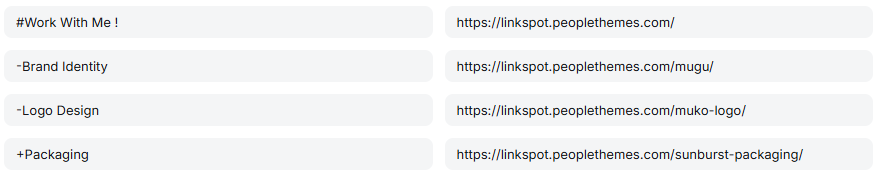
Example navigation labels, in order:
# Work With Me!
- Brand Identity
- Logo Design
+ Packaging
This produces one collapsible row labeled "Work With Me!" that expands to show "Brand Identity", "Logo Design", and "Packaging" when tapped. A chevron icon on the right flips direction (▼ closed, ▲ open) to show the group's current state.

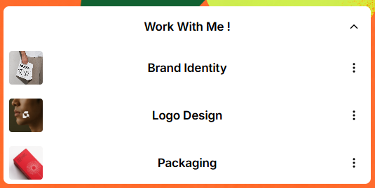
Note: Only one group can be open at a time. Opening a group automatically closes any other group that was already open.
Note: The group's header item (the one labeled with a # prefix) still needs a real URL value filled in — it's just discarded once the row becomes a toggle button. Don't set that URL to exactly #, since that's reserved for section dividers above and it won't turn into a group. A placeholder like #group1 works fine.
Note: The very first link row in the list automatically gets a subtle "wiggle" animation to draw attention to it — this happens automatically and isn't a toggle you need to set.
Automatic Link Icons
Icons aren't a separate setting — they're generated automatically from the links you already add under Ghost Admin → Settings → Navigation → Primary navigation. Each navigation item has two fields:
- Label – the text shown on the homepage.
- URL – the destination link. This is the field Linkspot scans to pick an icon.
Linkspot reads the URL, matches it against a list of 100+ recognized services, and automatically shows the matching icon to the left of the label — no icon picker or manual upload needed.
How it works:
- Go to Settings → Navigation in Ghost Admin.
- Add a new row under Primary navigation.
- Enter any text you like in Label — for example, "Follow me on Instagram".
- Enter the real destination in URL — for example,
https://instagram.com/yourhandle. - Save.
- On your homepage, that row now shows the Instagram icon automatically, with no further setup.
Examples:
| Label | URL | Resulting icon |
|---|---|---|
| Chat on WhatsApp | https://wa.me/6281234567890 | |
| Shop on Shopee | https://shopee.co.id/yourstore | Shopee |
| Order on GoFood | https://gofood.co.id/yourstore | GoFood |
| Listen on Spotify | https://open.spotify.com/artist/xxxx | Spotify |
| My portfolio | https://myportfolio.com | Generic link icon (domain not recognized) |
The icon is always determined by the URL, not the Label — the Label can say anything ("Click here", "Check this out") and the icon will still match the destination.
If the wrong icon (or a generic link icon) shows up:
That means the domain in your URL isn't in the list of 100+ recognized services. You can force a specific icon by adding a manual tag anywhere in the URL:
- Original URL:
https://mytoko.com/menu - With tag added:
https://mytoko.com/menu#foodmenu - Result: the food-menu icon is shown, even though
mytoko.comitself isn't a recognized domain.
The tag doesn't change where the link goes — clicking it still opens mytoko.com/menu as normal. It's only read by the theme to choose an icon.
Available manual tags:
#food #foodmenu #beverage #store #catalog #target #workshop #trolley #comment #lock #avatar #share #rss #feature #promo #cart1 #cart2 #cart3 #google #browser #menu #search #gridmenu #chrome #safari #apple #android #ios #macos #linux #opera
To hide the icon entirely for a specific row, add #noicon to its URL — for example: https://mytoko.com#noicon. The row still shows as a normal link, just without an icon slot in front of the label.
Internal links get a special treatment: if a URL points to a post or page on your own site, Linkspot skips icons entirely and instead pulls that post/page's featured image, using it as the row's thumbnail. This is what you'll see for internal links like a product page or blog post — a real photo instead of a generic icon.
Full list of recognized categories:
- Social platforms: YouTube, Instagram, Facebook, TikTok, X/Twitter, Threads, Mastodon, Bluesky, LinkedIn, Snapchat, Pinterest, Reddit, VK, WeChat, Twitch
- Messaging: WhatsApp, Messenger, Viber, KakaoTalk, Kik
- Payments & finance: PayPal, Stripe, Venmo, Cash App, Klarna, Wise, Revolut, Visa, Mastercard, American Express
- Shopping & delivery: Shopify, Etsy, AliExpress, Shopee, Tokopedia, Gojek, GoFood, GoPay, Grab, Uber, Lyft
- Work & dev tools: GitHub, Notion, Trello, Asana, Confluence, npm, Kubernetes, DigitalOcean, Netlify, Vercel
- Google Suite: Google, Google Play, Google Maps, Google Chrome, Google Meet
- Streaming & media: Spotify, SoundCloud, Deezer, Twitch, Crunchyroll, HBO Max, Paramount+, Vimeo
If a link doesn't match any known pattern, a generic link icon is shown instead.




Homepage Tabs
Below the profile block, Linkspot can show a two-tab segmented switcher — for example "Links / Posts" — controlled by two independent settings groups:
- First tab label and First tab content (first, first_display)
- Second tab label and Second tab content (secondary, secondary_display)
Each tab's content can be set to:
- None – the tab is hidden entirely.
- Link – shows your Navigation-based link list (see above).
- Post – shows your regular blog posts (featured posts first, then the rest).
- Tag – shows posts from one or more specific tags.
- Author – shows posts from one or more specific authors.
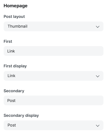
If you choose Tag or Author for a tab, enter the matching slug in the Tag/Author slug field for that tab (e.g. travel), or several slugs separated by commas to combine them (e.g. travel,opinion) — they'll be pulled in that order.
Behavior notes:
- If only one tab is set to something other than None, that content shows directly with no tab switcher.
- If both tabs are set to None, no panel is shown below the profile at all.
Button Style
Controls how every link and post row button looks across your entire site — this one setting affects your link list, post rows, and any button-style element consistently.
Button type
Controls the fill/background style of every row:
- Solid – flat, opaque background using your chosen Button background color. This is the default and works with Button shadow.
- Glass – a frosted, semi-transparent background (blurred glass effect) that lets your page background show through slightly. Button background color is ignored in this mode — the background is always a translucent white overlay instead.
- Bold – solid fill combined with a hard offset shadow using your Button border color, plus a slightly thicker border. Gives rows a "sticker" or comic-style look. Button shadow doesn't apply in this mode (Bold has its own built-in shadow).
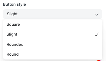
Button style
Controls corner rounding on every row and thumbnail:
- Square – sharp, 90° corners.
- Slight – subtle rounding (8px).
- Rounded – noticeably rounded corners (16px).
- Round – fully rounded / pill-shaped rows. Thumbnails also become perfect circles in this mode.




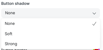
Button shadow
Adds a drop shadow beneath each row. Only takes effect when Button type is Solid (Glass and Bold ignore this setting, since they use their own shadow logic):
- None – no shadow.
- Soft – a light, subtle shadow.
- Strong – a more pronounced, deeper shadow.
Button background
The fill color used behind each row. Only applies to Solid and Bold types — Glass always uses a translucent white overlay regardless of this color.
Button text
The color used for the label text and the icon inside each row.
Button border
The border/outline color. Used differently depending on Button type:
- Solid & Bold: this is the row's actual border color (and also the shadow color in Bold mode).
- Glass: ignored — Glass always uses a fixed semi-transparent white border.



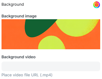
Background
- Background – the base color behind your page (also used as the mobile status-bar/theme color).
- Background image – optional. On desktop, it fills a centered, phone-width "app frame" behind your content; on mobile, it fills the full screen.
- Background video – optional .mp4 URL. When set, it replaces the background image with a looping, muted, autoplaying video in the same app-frame layout on desktop and full-screen on mobile.
Note: If a background video is set, it takes priority over the background image.
Social Links
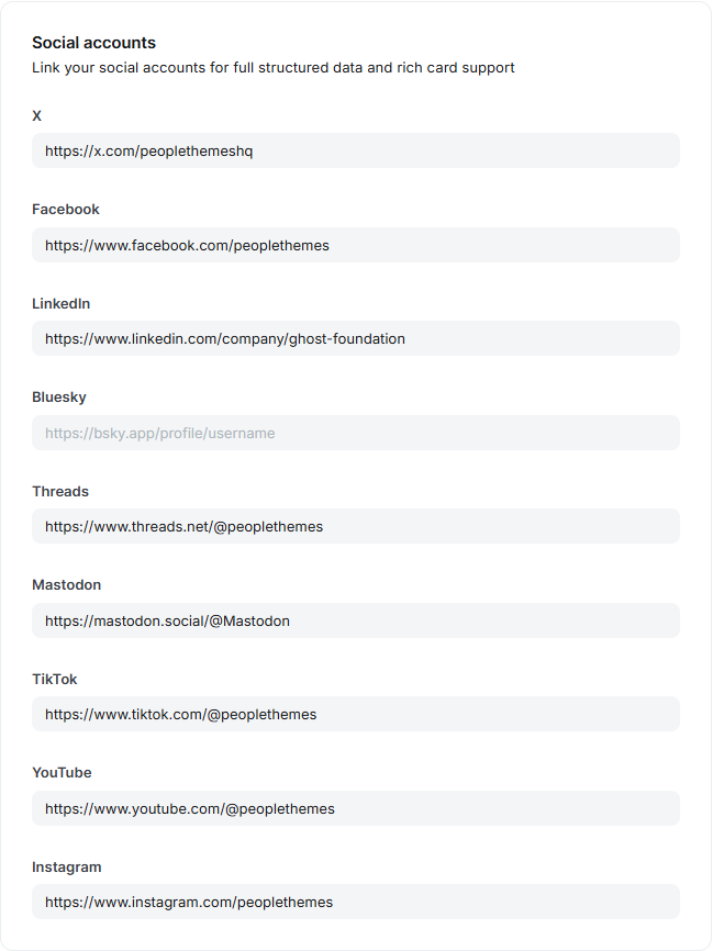
Linkspot displays your social icons using Ghost's own Social Accounts settings — you don't enter them as theme settings.
Ghost Admin → Settings → Social accounts
Paste the full profile URL for each platform you use. Linkspot currently displays icons for: X (Twitter), Facebook, Instagram, LinkedIn, Threads, Mastodon, TikTok, YouTube, and Bluesky.

Floating QR Code
On desktop screens (900px and wider), Linkspot shows a small "Scan on mobile" QR code fixed to the bottom-right corner of the page. It's generated automatically from your site URL — there's nothing to configure. It's hidden on mobile/tablet screens where it wouldn't be useful.
Share Modal
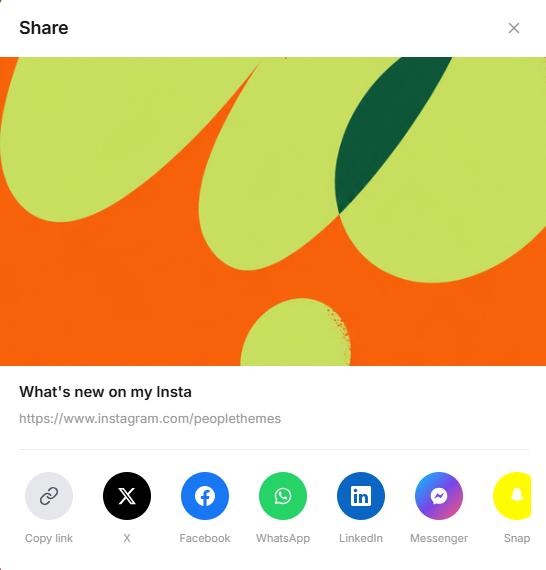
Every link row and post has a share (•••) button that opens a custom share sheet — not the browser's native share panel — with one-tap options for Copy link, X, Facebook, WhatsApp, LinkedIn, Messenger, Snapchat, and Email.
Post Modal & Internal Links
Internal links — your footer navigation, an "About" page, or an internal page/post linked from your Navigation link list — open in a smooth in-page bottom-sheet modal instead of a full page reload, keeping visitors on your homepage. On mobile, the modal can be dismissed with a downward swipe.
This is automatic and requires no setup; it only applies to links pointing to your own site (external links behave normally and open in a new tab).
Post Card Display
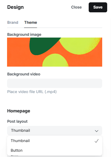
If you're using Post, Tag, or Author for one of the homepage tabs, the Post Layout setting controls how each post is presented in that feed:
- Thumbnail – shows the post's featured image as a card.
- Button – shows the post as a simple text row/button, matching the style of your link rows.
Featuring Posts
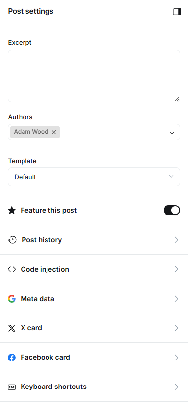
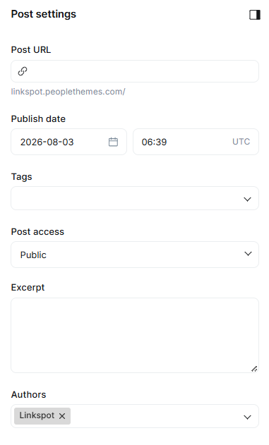
Ghost's built-in Feature this post toggle (found in a post's Post settings sidebar, under Excerpt and Authors) marks a post as "featured." This isn't a Linkspot-specific setting, but Linkspot uses it directly: whenever a homepage tab is set to Post, Tag, or Author, featured posts are always pulled to the front of that feed, ahead of your regular posts — regardless of publish date.
How to feature a post:
- Open the post in the Ghost editor.
- Click the Post settings icon (gear/sidebar icon, top right).
- Toggle Feature this post on.
- Save/update the post.
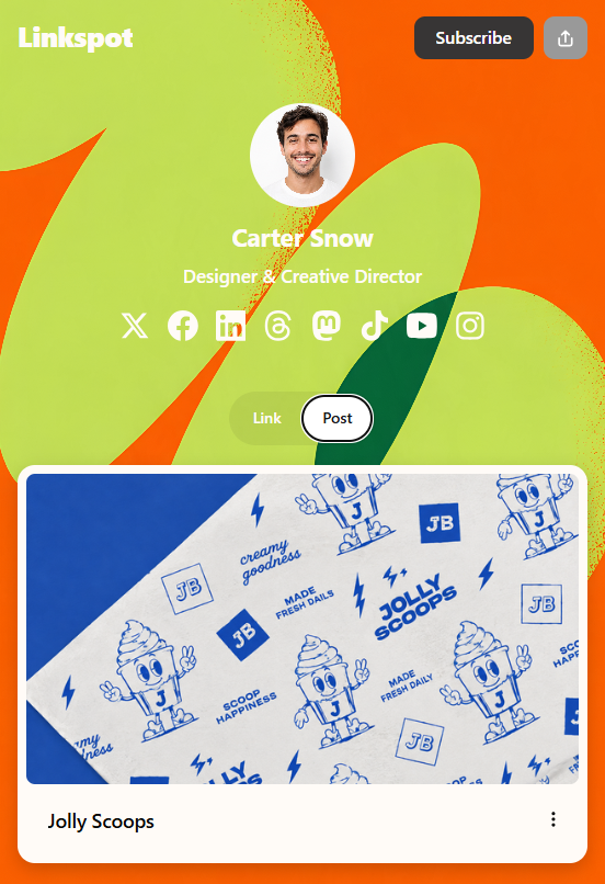
Where you'll see it: on your homepage, in whichever tab (First or Second) is set to Post/Tag/Author — the featured post appears first in that list, styled the same way as any other post row (Thumbnail or Button, per your Post Layout setting).
Optional Pages
Linkspot ships with two page templates that activate based on how you set up a Page in Ghost Admin:
Authors Directory
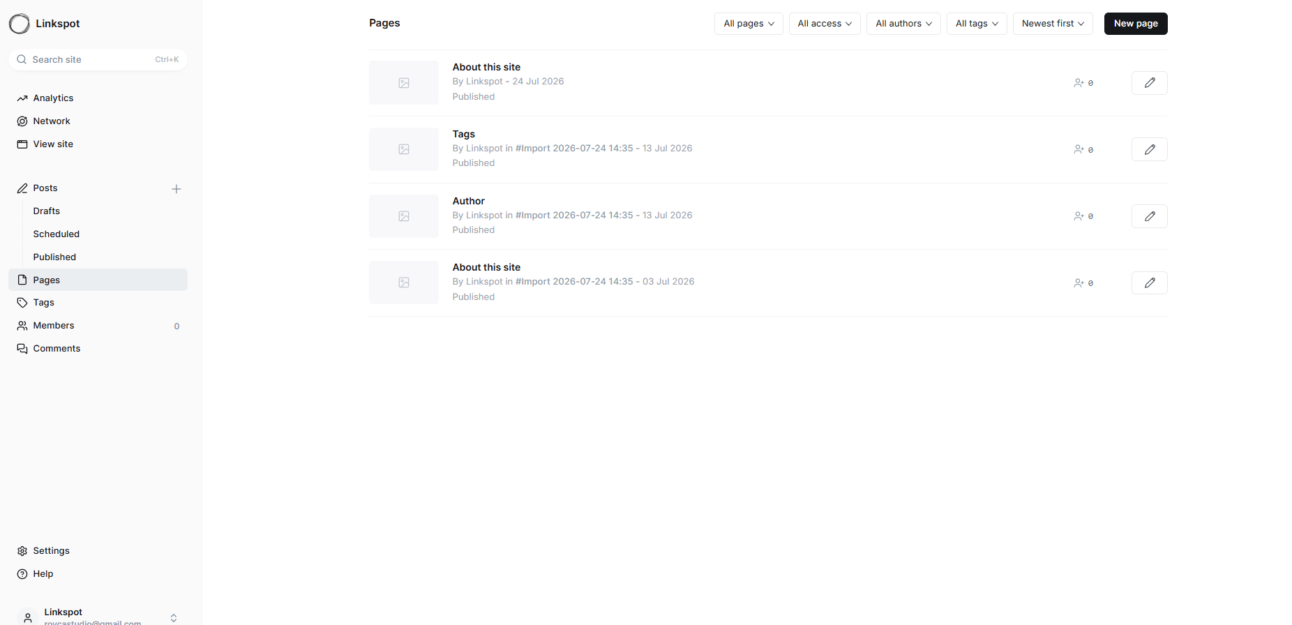
- Create a new Page in Ghost Admin.
- Set the URL slug to exactly authors.
- Publish it (the page content itself can be left empty — the template fills it in).
This automatically lists every author on your site with their avatar, name, location (if set), and post count.
Tags Directory
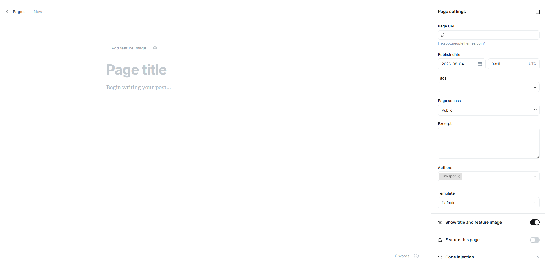
- Create a new Page in Ghost Admin (any title/slug).
- In the page's settings sidebar, set Template to the custom Tags template.
- Publish it.
This displays your page's own content followed by a full list of tags, each with its post count, sorted from most to least posts.
Membership
If Members are enabled on your site (Settings → Membership), the header automatically shows a Subscribe button for logged-out visitors (or Sign in if invite-only), and an Account button for logged-in members. If Members are disabled, this area is hidden entirely — nothing to configure in the theme itself.
Updating the Theme
All of your settings (colors, navigation/links, tab configuration) are stored in Ghost's database — not in the theme files. This means you can safely upload a new version of the Linkspot.zip at any time without losing your configuration. If you've made any direct code edits to the theme files, back those up first, since re-uploading the theme will overwrite them.
Troubleshooting / FAQ
Q: My links aren't grouping into a collapsible section
A: Check the exact prefix characters in your Navigation labels — a group needs to start with #, have its middle items start with -, and its last item start with +, with no extra spaces before the prefix.
Q: My "group" label isn't turning into a collapsible accordion — it just shows as a plain heading
A: Same cause as above — the header item's URL is set to exactly #. Use any other placeholder URL (e.g. #group1) for the group's header row.
Q: A link is showing the wrong icon (or a generic link icon)
A: Icons are matched automatically from the link's URL. If a service isn't in the supported list, try adding one of the manual tags (e.g. #store, #menu) to the end of the URL to force a specific icon.
Q: The Authors or Tags page is blank.
A: For the Authors page, make sure the Page's URL slug is exactly authors and it's Published. For the Tags page, make sure you selected the Tags template in the page's settings and it's Published.
Q: One of my homepage tabs isn't showing.
A: If a tab's content type is set to Tag or Author, make sure you've also filled in the matching slug field — an empty slug will show nothing for that tab.
Q: The QR code isn't showing up.
A: It's desktop-only by design (900px+ screen width) — it's intentionally hidden on mobile and tablet.
Updates
Release First Version — 17 August 2026
Credits and Support
- Theme: Linkspot, by People Themes
- Usage: Commercial and personal use allowed
- License: Subject to People Themes licensing terms
- Support: support@peoplethemes.com
- Terms: Terms of Service
For full licensing, usage, and redistribution terms, please refer to our Terms of Service.
People Themes
About
We're a small studio focused entirely on Ghost — designing themes that are clean, fast, and built to last. From layout to typography, every detail is considered so you can focus on your content. We believe good design should feel unique, without compromising function."
Support
Stuck on something, or just have a question about this theme? Drop us a message — we usually reply within 24 hours.
People Themes — Uncommon Ghost themes.