Grid
SIDE: Key Features Installation Quick Start Checklist Theme Settings Post Settings Navigation Optional Pages Comments Updating The Theme Troubleshooting / FAQ Announcement Bar Social Accounts Blocks Updates Credits and Support
Documentation
Grid is a clean, image-based Ghost theme for visual-first publishing, showcasing photography, design, and everyday moments like a feed. No clutter, no dense metadata, just the work, front and center. Dark mode, flexible navigation, and full grid control included. This page covers everything you need to set it up and make it your own.
Key Features
- Pure visual post grid — thumbnails only, with an optional hover reveal for title and tag
- Fully configurable grid: thumbnails per row, aspect ratio, and gap
- Three pagination styles: Infinite Scroll, Load More, and Pagination
- Dark mode with a manual toggle in the header
- Custom multi-level dropdown and "More" overflow navigation, built without code
- Dedicated Authors directory and Tags directory templates
- Built-in Blocks — button and shop-button shortcodes you can type directly in the editor
- Smooth scroll powered by Lenis
- Social account integration for sharing and structured data
Installation
- Download the theme
.zipfile. - In Ghost Admin, go to Settings → Design and branding → Change theme.
- Click Upload theme and select the
.zipfile. - Once it's validated, click Activate.
If the upload is rejected, make sure the .zip contains the theme files directly at the top level, not inside an extra wrapper folder.Quick Start Checklist
Right after activating, do these in order:
- Set your logo, publication icon, and accent color under Settings → Design and branding → Brand.
- Choose your grid layout: Thumbnails per row, Thumbnail aspect ratio, and Thumbnail gap — see Theme Settings.
- Decide whether readers should see the title/tag on hover — see Thumbnail Hover.
- Pick a Pagination style for the homepage feed.
- Set up your Navigation — see Navigation for the prefix syntax.
- Create the optional Authors and Tags pages — see Optional Pages.
Theme Settings
All of these live under Settings → Design and branding → Brand and theme.
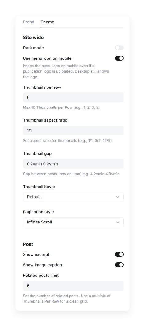
Dark Mode
Sets the default color mode for new visitors.
- Off / default — the site loads in light mode. Visitors can still switch manually using the sun/moon toggle in the header.
- On — the site loads in dark mode by default.
Use Menu Icon on Mobile
When enabled (default), the mobile header always shows the burger menu icon, even if you've uploaded a publication logo.
On desktop, your logo still displays normally regardless of this setting.
Thumbnails Per Row
Controls how many post thumbnails appear in each row of the grid.
Enter a number from 1 to 10
Default: 6
3= fewer, larger thumbnails per row6= the default, balanced density10= a dense, tile-like grid
Thumbnail Aspect Ratio
Controls the shape of every thumbnail in the grid.
Enter a ratio such as 1/1, 3/2, or 16/9
Default: 1/1
1/1= square thumbnails3/2= standard landscape16/9= widescreen
Thumbnail Gap
Controls the spacing between thumbnails. Enter two values — row gap then column gap.
Default: 0.2vmin 0.2vmin (a tight, edge-to-edge grid).
0.2vmin 0.2vmin= minimal spacing, images sit almost flush against each other4.2vmin 4.8vmin= a looser row gap with slightly wider columns
Thumbnail Hover
This is Grid's signature interaction. When a reader hovers over a thumbnail in the feed, the post title and primary tag fade in smoothly over the image — controlled entirely by this one dropdown, no code required.
Available options:
- Default — the thumbnail stays clean on hover; no title or tag overlay.
- Show Title & Tag — the title and primary tag fade in over the image on hover.
Pagination Style
Controls how visitors load more posts on the homepage, author, and tag feeds.
Available options:
- Infinite Scroll (default) — automatically loads more posts as the visitor scrolls down.
- Load More — shows a Load More button beneath the grid.
- Pagination — shows numbered page navigation.
Post Settings
These live under the same Theme tab, grouped under Post.
Show Excerpt
Toggles whether each post's custom excerpt displays on the post page.
Default: On.
Show Image Caption
Toggles whether a feature image's caption displays beneath it on the post page.
Default: On.
Related Posts Limit
Controls how many posts appear in the related-posts section at the bottom of an article — Grid first tries posts sharing the same primary tag, then falls back to the most recent posts if there aren't enough.
The related-posts section uses the same column count as your Thumbnails Per Row setting, so for a clean final row, set this to a multiple of it — never below it.
Example: if Thumbnails Per Row is 6, use 6, 12, 18, or 24. If it's 4, use 4, 8, 12, or 16.
Default: 6
Navigation
Set up navigation under Settings → Navigation. Grid builds header dropdowns and populates the burger/overflow menu from a single flat list using prefixes in the Label field — no code required. The burger menu icon is always visible regardless of your navigation setup; prefixes just control what content appears inside it. A group closes automatically as soon as a plain (non -) item appears, so you don't need a closing symbol.
Special prefixes:
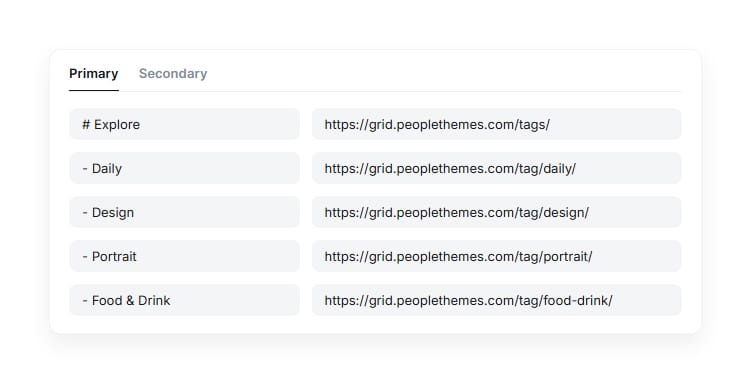
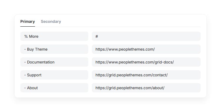
#– Starts a header dropdown group. Everything after it becomes a dropdown, until a non-item appears.%– Adds a labeled section of links into the burger/overflow menu. It doesn't create the menu itself — the burger icon shows either way, this just decides whether there's content inside it.-– A sub-item belonging to whichever#or%group is currently open.- (no prefix) – A normal top-level link, and it closes any open group above it.
Example Header Dropdown #
Result Header Dropdown #
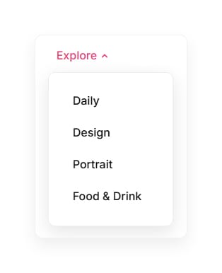
This creates an "Explore" dropdown with four links in the header nav.
Example Burger Menu %
Result Burger Menu %
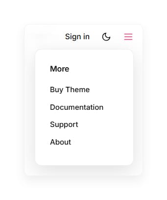
This adds a "More" section with four links to the burger/overflow menu.
Making a group header non-clickable:
By default, a # group header uses whatever URL you enter as its own link — set the URL to # if you want it to only open the dropdown instead of navigating anywhere.
A % group header is never clickable, on desktop or mobile, no matter what URL you put in it — it only exists to label that section inside the burger/overflow menu. It's still recommended to enter # in its URL field anyway, just to keep your Navigation list clean and consistent at a glance.
Optional Pages
Grid ships with two custom page templates: Authors and Tags.
Unlike slug-based templates, these are manually selected in the Ghost editor:
- Create a new Page in Ghost Admin and give it a title.
- Open the page's settings sidebar and look for the Template dropdown.
- Select Authors or Tags from the list.
- Publish the page — you can leave the page content empty for the Authors page; for the Tags page, any content you add displays above the tag list.
The page title can be anything you like ("Authors", "Our Team", "Meet the Writers"), and the URL slug can be anything too (e.g. /team/ or /our-writers/) — what determines which layout is used is the Template selected in step 3, not the page title or URL.
If you select the wrong template (e.g. Tags on a page meant to list authors), the page will still publish, but it'll pull the wrong data — double check the Template dropdown matches what you intend to display.
Comments
Grid supports Ghost's native commenting system. Enable it under Settings → Membership → Access, then choose who can comment on posts (all members, paid members, or off).
Updating The Theme
All of your settings (colors, navigation, custom toggles) are stored in Ghost's database — not in the theme files. This means you can safely upload a new version of the theme .zip at any time without losing your configuration. Always back up any direct code edits you've made before updating, since those will be overwritten.
Troubleshooting / FAQ
My navigation dropdown isn't showing.
Double-check the Label field starts with # (with no extra space before the text), and that the item you expect to be a sub-item doesn't accidentally start with - before the # item opens the group.
My "More" % items aren't showing up in the burger/overflow menu.
Double-check the Label field starts with % (with no extra space before the text), and that its sub-items each start with - right after it — a % group with no - items under it will just show an empty section header in the menu.
The Authors or Tags page is blank or shows the default page layout.
Make sure you selected Authors or Tags from the page's Template dropdown in the Ghost editor sidebar — these templates are chosen manually, not by the page's title or URL slug, so the page can be named and linked anything you like as long as the correct Template is selected.
My Blocks shortcode isn't turning into a button.
Make sure the whole line is its own paragraph (nothing else in the same paragraph), uses double quotes exactly as shown, and starts with :: and ends with ::.
Thumbnails look stretched or cropped.
Check Thumbnail Aspect Ratio — a mismatch between the ratio you set and your uploaded images' natural proportions is the most common cause.
Hovering over a thumbnail does nothing.
Check that Thumbnail Hover is set to Show Title & Tag — it's off (Default) out of the box.
Announcement Bar
The Announcement Bar lets you display a message at the top of your website, site-wide. It's useful for promoting offers, product launches, events, or other updates.
How to customize it:
- Go to Ghost Admin → Settings → Site.
- Find Announcement Bar and click Customize.
- Enter your announcement message.
- Choose a background color.
- Select the visibility: logged-out visitors, free members, paid members, or any combination.
- Click Save.
Notes:
- Changes apply immediately after saving.
- Visitors can dismiss the bar by clicking the × (Close) button.
- Keep the message short. Long text gets cramped on mobile since the bar is a single line.
Social Accounts
Grid pulls your social links from Ghost's built-in Social Accounts settings and displays them wherever the theme's social icons appear.
Ghost Admin → Settings → Social Accounts
Paste the full URL of each profile into its corresponding field and save. Grid ships with icons for: Facebook, Instagram, X / Twitter, LinkedIn, Threads, Mastodon, TikTok, YouTube, and Bluesky.
Blocks
Grid includes three lightweight button "blocks" you can type directly as plain text in the Ghost editor, no HTML card needed.
For the full list of blocks, their syntax, and live examples, see the Blocks Documentation.
Updates
Release First Version, 4 August 2026
Credits and Support
- Theme: Grid by People Themes
- License: MIT
- Support: support@peoplethemes.com